

¡Hello YCLAS friends! This week we are sharing some tips and good ideas to make your website look better using the CSS code.
You need to know that the appearance of your website will determine if users and customers stay, or leave in search of a better-looking site.
First, you have to enable the CSS use, at your website panel; Click Here to see How To Enable And Add Custom CSS on YCLAS.
Let's start!
Background
Nowadays, the best websites use degraded backgrounds, it's a simple and smooth color change, if you use the correct ones your site will take a modern style, here you have 3 different modern backgrounds:
Gradient #1 (Pacific Colors)
#grad

{background-image: linear-gradient(135deg, #f5f7fa 0%, #c3cfe2 100%);

}

Gradient #2 (Strong Colors)
#grad

{background-image: linear-gradient(to top, #fdcbf1 0%, #fdcbf1 1%, #e6dee9 100%);

}

Gradient #3 (Smooth Colors)
#grad

{background-image: linear-gradient(to top, #cfd9df 0%, #e2ebf0 100%);

}

Fonts
The font of your website plays a fundamental role, we recommend you to use Sans-Serif fonts, like:
Arial
p.sansserif {

font-family: Arial, Helvetica, sans-serif;

}
Tahoma
p.sansserif {

font-family: Tahoma, Geneva, sans-serif;

}
Trebuchet MS
p.sansserif {

font-family: "Trebuchet MS", Helvetica, sans-serif;

}
These are comfortable fonts for the eye.
Element Borders
Another tip, is to use rounded edge for elements, this makes your website look simple and modern, to achieve that, use this code:
p.round {

   border: 2px solid black;

   border-radius: 8px;

}

You can adjust the color (solid black) and radius (8px) of the border.
Navigation Bar
The navigation bar is one of the most important things on a website. A well-done navigation bar will help users to navigate properly on your site. Here is a Sticky-Active/Current Navigation Bar; it will make your navigation bar move and sticks on top depending on the scroll position:
ul {

  list-style-type: none;

  margin: 0;

  padding: 0;

  overflow: hidden;

  background-color: #4682B4;

  position: sticky;

  top: 0;

}


li {

  float: left;

}


li a {

  display: block;

  color: White;

  text-align: center;

  padding: 14px 16px;

  text-decoration: none;

}


li a:hover:not(.active) {

  background-color: #111;

}


.active {

  background-color: #4169E1;

}

</style>

</head>

<body>


<ul>

  <li><a class="active" href="#home">Home</a></li>

  <li><a href="#search">Search</a></li>

  <li><a href="#YCLAS">YCLAS</a></li>

  <li><a href="#contact">Contact</a></li>

  <li><a href="#about">About</a></li>

</ul>
You can change the colors (Background, Text, and Active/Current Link), and resize (Padding) the navigation bar.

Responsive Images
¡Images! Nowadays images are essential at all websites, and we are used to seeing images everywhere; but, it is not just to put an image on your website, you have to set that image as responsive image to get a better looking on any device. To achieve that, use this code for all the images you want to be responsive:
img {

  max-width: 100%;

  height: auto;

}

</style>

</head>

<body>


<img src="X" width="IMG width" height="IMG height">
The X represents the image URL, at IMG Width and IMG Height you have to write the original size of the image.
Website Layout
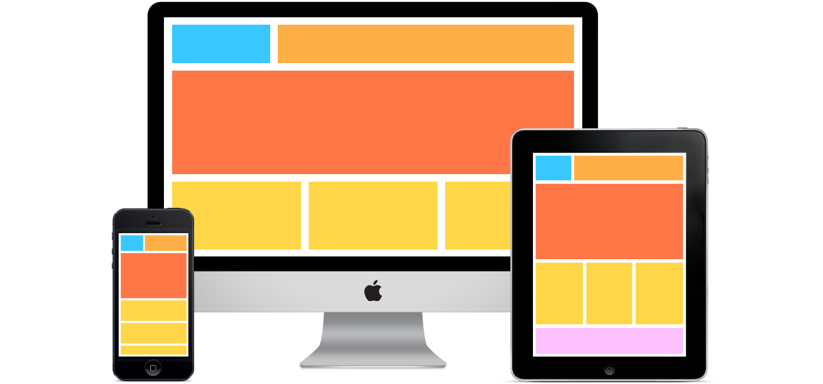
Well, this is the distribution of the principal elements on your website, e.g. the Header, the header is the first element that any user sees when they enter t website, so, it has to be easy to understand and simple. Here is a CSS code for an image header with text:
body {

  margin: 0;

}


.header {

  background:url(X) no-repeat;

  padding: 20px;

  text-align: center;

}

</style>

</head>

<body>

<div class="header">

  <h1>HEADER TEXT</h1>

</div>
The X represents the image URL, at Padding you can set the size of the image header, and Header Text is where you can write what you want to show above the header image.
Another principal element of your website is the Footer, placed at the bottom of your page, as important as the header. You can use this code for a good looking footer:
.footer {

  background-color: #00FFFF;

  padding: 25px;

  text-align: center;

}
You can change the color and size (padding) of the footer.
Modern CSS in 2026: what has changed since these tips
The snippets above still show the basic ideas, but CSS has moved on a lot since this post was written. Browsers now share a common baseline of features, and the theme your site runs on decides which selectors your CSS can target. Here is what to know before you paste anything into your custom CSS.
Check browser support with Baseline
Baseline, defined by the W3C WebDX Community Group, labels a feature "newly available" once it works in all the core browsers (Chrome, Edge, Firefox and Safari, on desktop and mobile). It becomes "widely available" 30 months later, when most sites can use it without worrying about older browsers. MDN shows the Baseline status at the top of every reference page. These are the features that replace most of the workarounds above:
| Instead of... | Use today | Baseline status (MDN) |
|---|---|---|
| Repeating hex colours in every rule | CSS custom properties (variables), e.g. var(--nova-accent) | Long established |
| Hand-picking hover shades | color-mix(), e.g. the accent mixed with 18% black | Widely available (in all major browsers since May 2023) |
| Extra classes or JavaScript to style a parent | :has(), e.g. form:has(:invalid) button { opacity: .6; } | Widely available (in all major browsers since December 2023) |
| Long, repeated selectors | CSS nesting with & | Widely available (in all major browsers since December 2023) |
| Media queries tied to the screen width | Container queries (@container), so a card adapts to the column it sits in | Widely available (in all major browsers since February 2023) |
Floated menu items (li { float: left; }) | Flexbox: display: flex; gap: 8px; | Long established |
Start from your theme, not from a blank page
The current Yclas guide turns custom CSS on under Design > Custom CSS, with the "Use custom CSS" switch. It also warns that class names differ between themes, so a rule written for one theme may do nothing after you switch. Generic selectors like #grad or ul either do nothing or restyle every list on your site, so always target the classes your theme really uses (right-click an element and choose Inspect in your browser to find them).
New Yclas sites run the Nova theme, which is built on CSS variables. To change the main colour, use the accent colour setting in the theme options instead of CSS: buttons, links and highlights all follow it, and the hover shade is calculated for you. For other adjustments, overriding a variable is safer than rewriting rules, because one line changes every element that uses it:
:root {
  --nova-radius: 10px;     /* rounder or squarer cards and buttons */
  --nova-radius-sm: 6px;
}
Two more rules keep you out of trouble. The custom CSS box only takes CSS, so leave out the <style>, <head> and HTML tags shown in some snippets above. And check every change on a phone as well as a computer before you save.
Try these tips and let us know if they work for you!
Note: The use of the CSS code requires some skills and experience, if you have never used CSS we recommend you to use some CSS Tutorials and CSS Guides to achieve what are you looking for. If you don't want to use CSS, you can use our themes, we offer a variety of custom website templates Click Here To See Them.
Regards,
YCLAS team.

